Last updated on 12 May 2026
Flourish is a great data visualization tool. It's pretty easy to handle and it's free. Unlike some complex tools for data professionals, Flourish is simple enough to be used by almost anyone …ou.
It is also powerful enough to be used in more ambitious projects. Flourish comes with a wide selection of templates so you can create a quality interactive data visual to embed on a site or use in a presentation.
A major update in January 2022, the Flourish tool was acquired by the Canva Platform that we no longer present. Canva is getting its hands on a little gem that will enrich its current offer with graphic tools. An integration with the graphic studio Canva that will allow Flourish to continue to develop and grow.
Table of Contents
Easily turn your data into impressive graphics, maps and interactive stories.
Flourish was originally built for large media editors who increasingly use such tools to interpret and script raw data. Initially reserved for specialists, this type of tool has become much simpler. Flourish is a good example of this trend.
Very powerful tool, it allows everyone to easily stage a dataset with a series of templates that you will be able to customize as you seem. There is nothing to install everything is done online. It is difficult to cite here all the models available. Among them, of course, the inevitable bar chart. Very useful for comparing changes over time. All you have to do is have two or more entities whose numbers change over time. You can use it for a comparison of population growth, evaluation of sports performance of several athletes or … an analysis of COVID vaccination rates in different countries.
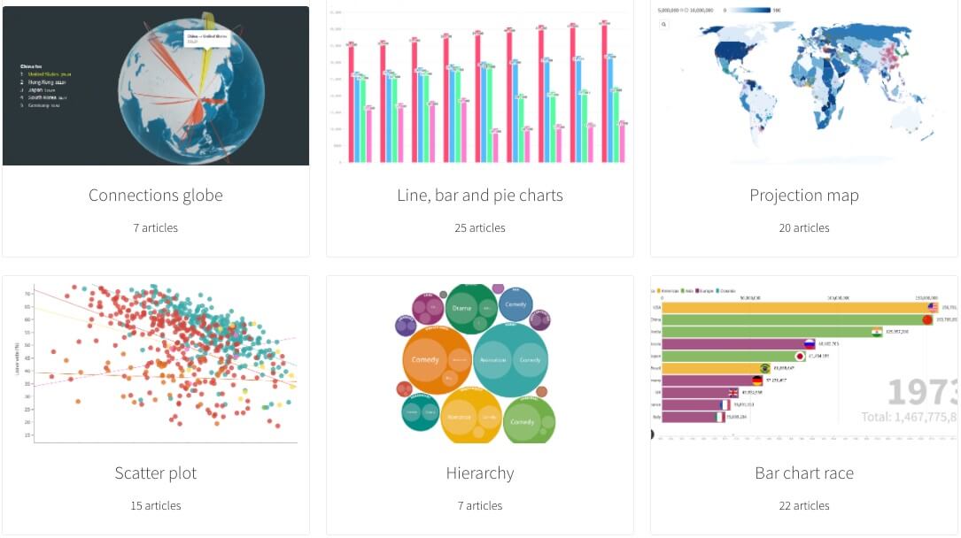
There are classic models of this type but there are also much more original models that will catch the eye and attention of your reader. The hardest thing will be to choose the best model, the most suitable for you.
Just download a spreadsheet or connect to an online source, choose its model and the trick is played.
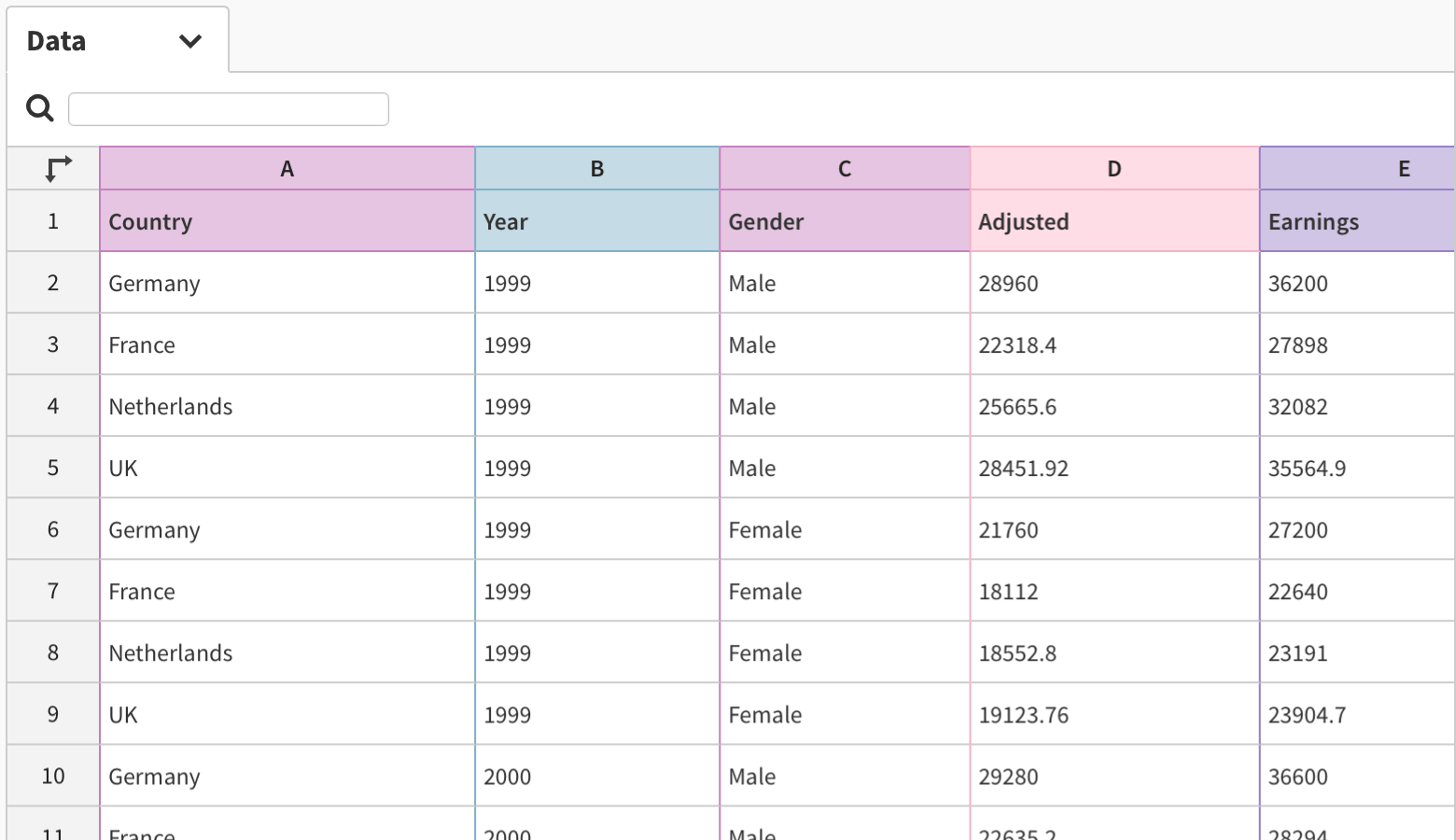
You will be able to retrieve your creations as images and in many formats. You will also be able to easily integrate an infographic into a site or blog thanks to an html code provided by the site.
Advanced features to make a narration with your data
Flourish offers several interesting functions that are really practical to use. For example, you can annotate infographics to help explain complex datasets or anomalies. Practical.
Interesting also the possibility of combining several visuals to create a complete "history". In addition, they are like Keynote or PowerPoint slides, but data-centric and interactive. Here is an example.
This is enough to animate your presentations with computer graphics games that you will be able to project with magnificent transitions like in Keynote or PowerPoint.
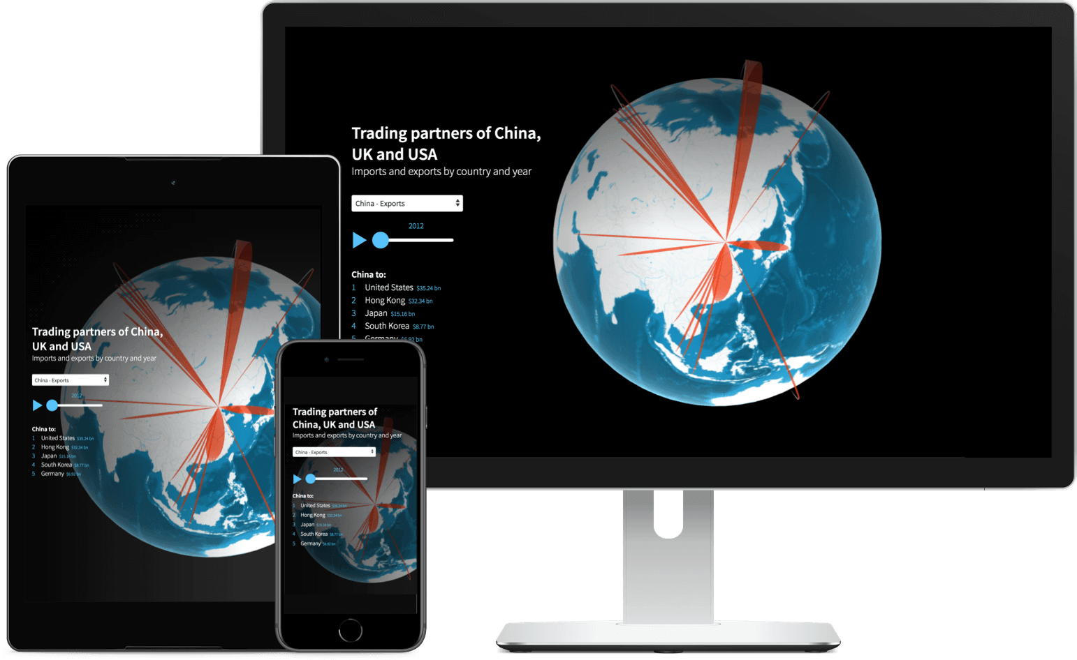
Another positive point is that the datavisualizations created work as well on computer as on tablet or smartphone.
Flourish in Canva, an integration that goes without saying

The two companies have many things in common. Like Flourish, Canva’s goal is to make a complex discipline easier and more accessible, to “give the world the power to design”. Like Flourish, Canva achieves this in part by using templates to help users get advanced results quickly.
Simplicity of handling, ease of use, quality results, both tools have quite similar strengths.
Common points, but also very complementary functions and specialties. While Flourish focused on visualization and interactivity, Canva has made huge progress in all other aspects of visual communication. Its collaborative drag-and-drop editor allows users to design everything from presentations to websites to videos.

Concretely and pending further developments, you can now add Flourish visualizations to Canva presentations. A new plug-in helps you easily include your Flourish graphics in Canva presentations and designs, even if they are not published publicly.
You can use the Flourish tool free of charge. Only small constraint all your creations are public. You will also find this data visualization tool in Canva Pro subscriptions.

 English
1 Response
[…] public data remains an exercise reserved for insiders. Some tools like Datawrapper or Flourish make it possible to format a dataset, but it's still very difficult to find and […]