Last updated on 13 May 2026
What can datavisualization bring to the understanding of major historical events? The Fallen is an interactive experience that will finally convince the most skeptical.
If you feel like you have something to do with a new fashion, check out this site. It may change your mind. The datavisualization it is the study, science or art of visual representation of data. The creator of The Fallen pushed the art of representation very far to allow everyone to visualize the terrible human carnage of the Second World War.
The Fallen, means the "fallen". Those who died during this terrible conflict.
World War II: a human toll An interactive documentary on the human cost of World War II. This graphic visualization lasts a quarter of an hour and uses film storytelling techniques to offer a new and dramatic perspective on a pivotal moment in our history.
The film follows a linear narrative, but you can pause during key moments to interact with the graphics and get deeper into the numbers.

The perspective offered by The Fallen of this dark period compared to more recent years gives even more strength to the need to preserve peace in the face of the rise of extremism of all kinds.
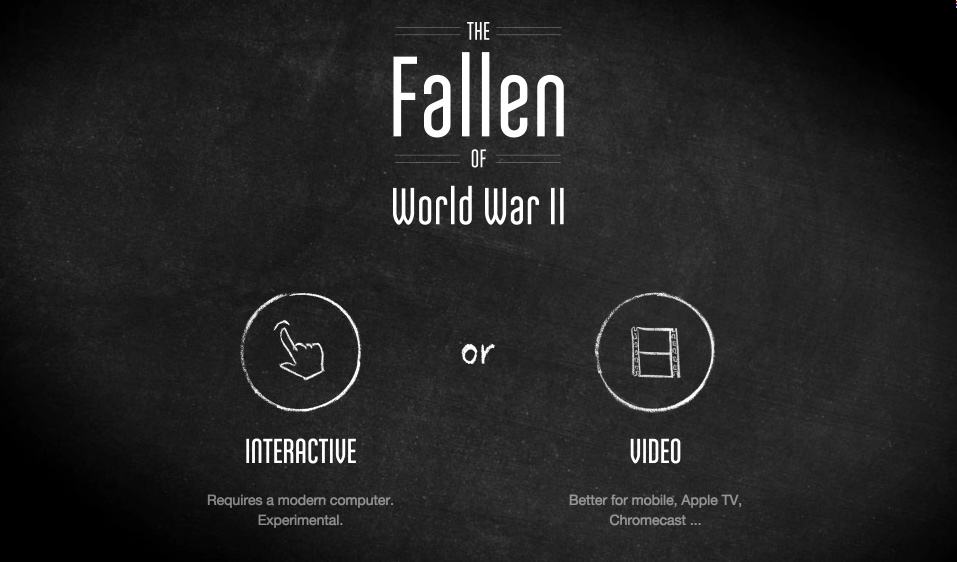
The Fallen offers two types of consultation. The most interesting and interactive version, but it requires a recent computer and a good connection.
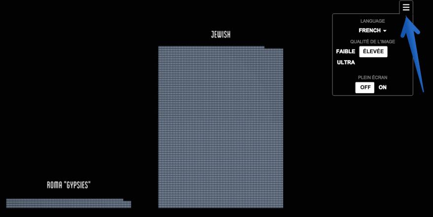
Don’t forget to go to the preferences at the top right of the screen to adjust the language of the comment.
A great document and a vivid example of what new technologies, in this case data visualisation, can bring to the understanding and teaching of history.
Attention, some illustrations of this interactive document may shock the youngest.
Link: The Fallen

Thank you for this beautiful discovery, I share it with my colleagues from now on!