Last updated on 15 February 2017
AirVisualEarth is a very special animated map. This global map shows real-time air quality in all countries around the world.
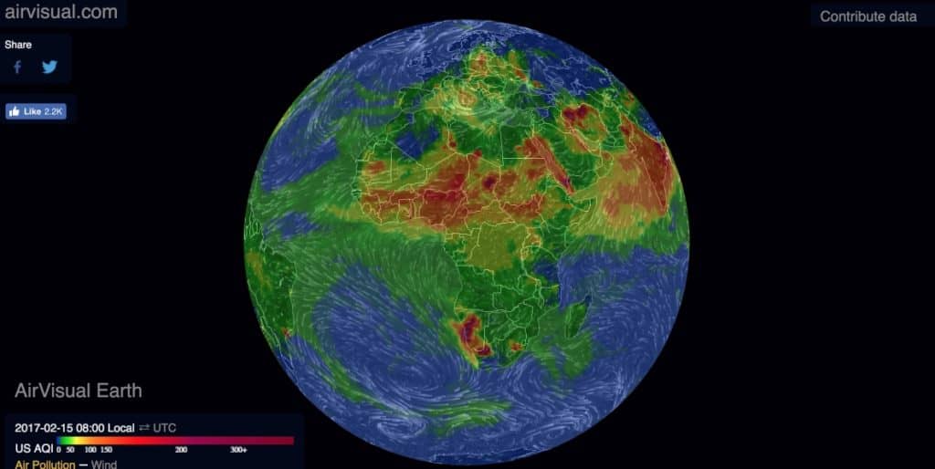
A ‘stifling’ radiology of the state of our planet to be used in your courses to visualize the problem of pollution in many cities and regions. This magnificent and at the same time terrible animated infographic was created and put online by a French start-up based in Pekin. It is no coincidence that the Chinese capital is one of the most polluted cities in the world.
AirVisualEarth is a good example of using big data and animated infographics to script and explain information interactively. The AirVisualEarth map is composed in real time from three main data sources. Public data from sensors in each country, start-up-specific terminals installed in large areas and data from satellite images.
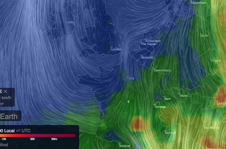
The result is spectacular to say the least. Our beautiful blue planet is pink, red and even dark brown in many places depending on the degree of pollution. You will also see the large moving air masses. The whole thing is manipulated with the end of the mouse. You can rotate the globe and zoom in on the region or city of your choice with a single click. That's great.
AirVisualEarth offers a map that updates in real time. The site is free.
Link: AirVisualEarth
It is impressive and at the same time it will serve me to choose my holidays.