Last updated on 12 May 2026
You have written a course on the French Revolution, a summary of the water cycle or a summary of the main steps in the scientific method. The text is ready. But you know thatA good scheme is worth a thousand words. for your students. Problem: you have neither the time nor the graphic skills to create it. This is where Napkin becomes interesting.
Table of Contents
How Napkin Works Concretely
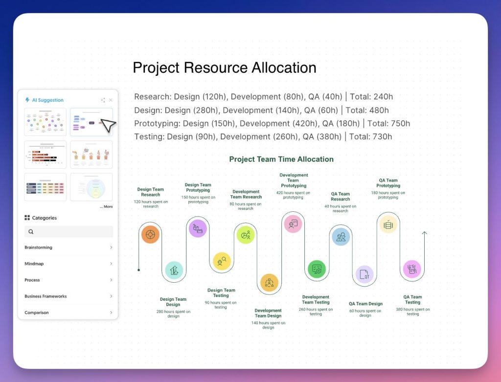
Forget the complex prompts. With Napkin, we understand in two minutes where to click. You paste or import your text into the editor, you start generation, and artificial intelligence automatically offers several visuals: infographics, diagrams, mind maps, flowcharts or data graphs. All that remains is to choose the one that best serves your educational intent. It is magical.
Don't stop at the first attempt. Try it out. On a rather long text, I cut into two paragraphs and obtained more legible visuals. It is sometimes necessary to test 2 or 3 proposals before having a truly pedagogical scheme. But it's still bluffing.
The tool does not stop at raw generation. Each visual is fully editable. You can change the icons by drawing from a large library, adjust the colors, change the connectors between the elements, choose a more formal or more casual typography.
🛠 Quick Guide: Creating Your First Schema with Napkin AI
For those who want to get started immediately, here is the way to go. It is disconcertingly simple:
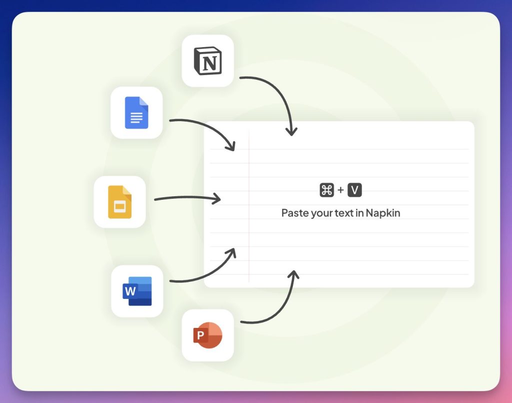
- Registration: appointment on Napkin.ai and log in (Google or email).
- Source text: create a new document ("New Napkin"), then paste your text or import it. A clear and structured paragraph often performs better than a list of keywords.
- Generation: click on the icon Spark (sparking). Napkin analyzes your text and offers several types of visuals.
- Personalisation: choose a visual, then edit texts, icons, connectors and colours to fit your educational purpose.
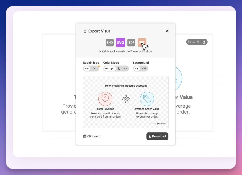
- Export: export to PDF (print/sheet) or PNG (insertion in Génially/Canva), or even in PPT if you want to rework in a slideshow.
Note: Creation and editing are currently done on a computer.
✅ Tips for Better Results
- Start with a short notion (10 lines) before sticking a whole chapter to it.
- Write in short sentences, with one idea per sentence.
- Structure your text with simple connectors: first, then, finally.
- Avoid paragraphs that are too long: cut into 3 to 6 lines.
- If the visual comes out too loaded, delete an element and restart: we often get a more readable diagram.
- As always, AI can interpret your text. A rereading is essential, especially in science or history (terms, causalities, arrows).
Many pedagogical uses
Let's take a concrete example. In history-geography you are preparing a course on migratory flows in the Mediterranean. You write a structured text with causes, main routes and consequences. Simply paste this text into Napkin to get an organizational chart ready to project in class or integrate into a sheet.
In French do you work on the structure of the narrative? You will be able to turn your explanation of the narrative scheme into an elegant visual frieze, much more telling than a linear paragraph. For mathematics, you can illustrate the steps to solve a problem in the form of a logic diagram. The resulting visual can then be used as a support for a interactive quiz. There is no shortage of examples of possible uses.
A tool that speaks more than 60 languages
Napkin supports more than 60 languages. The generated visuals automatically adapt to the language of your source text. You write in French, you get visuals in French. For the time being, the interface remains only in English, but it is intuitive enough to be user-friendly.
Export and share your creations everywhere
The visuals created in Napkin do not remain prisoners of the platform. Export is possible in PPT, PNG, SVG and PDF. In practice, you can then insert these schemas in Google Slides, Keynote or a Word document, or share them on social networks to enhance a class project.
The real-time collaboration feature is also worth noting. Several colleagues can work simultaneously on the same document, leaving comments directly on the visuals.
Napkin AI versus other visual tools
The difference with a platform like Canva or PowerPoint is simple: here, we do not start from a blank page. You do not start from an empty template to fill in. You start from your content, your text, and AI does the visual shaping work.
Napkin will not replace a professional graphic designer. But to quickly produce clear, coherent and aesthetic visuals from existing educational content, it is now a surprisingly effective tool. A service that clearly deserves a try.
FAQ (questions you may be asking)
Is Napkin AI free? There is a free version to test, with limits (especially on quotas). For occasional use, this may be enough.
Can we generate visuals in French? Yes: the visuals adapt to the language of the text provided. The interface is in English, but the use remains simple.
Can it be exported for use in class? Yes: exporting in PDF or PNG is convenient for a sheet, and exporting in PPT can help if you want to rework in a slideshow.
Does it work on mobile? You can view your creations, but creation and editing are mostly designed for computer use.
Can sensitive content (student data) be pasted into Napkin? In the school context, the most prudent approach is to avoid personal data (names of pupils, sensitive information, copies, assessments). If in doubt, check the privacy policy and conditions of use.
Can it be used with student texts? Technically yes, but I do not recommend any identifiable work. In the school context, it is better to anonymise or use “neutral” texts.
How rich are these tool presentations always very clearly explained! A huge thank you to the one who, every week, shares his discoveries with us and reminds us, by his example, that it is with pleasure that we can/should in turn share.
THANK YOU!
Thank you, this content was useful to me and allowed me to discover napkin.