Last updated on 12 May 2026
Luciole is a typeface specially designed for the visually impaired and visually impaired. Born from a two-year collaboration between the Regional Technical Centre for Visual Deficiency and the typographic design studio typographies.fr, this project was supported by the Swiss Ceres Foundation and the DIPHE laboratory of the Université Lumière Lyon 2.
Let them all be thanked here, because the result is really great. The Luciole font is one of the few typefaces designed, thought out, tested for a visually impaired audience.
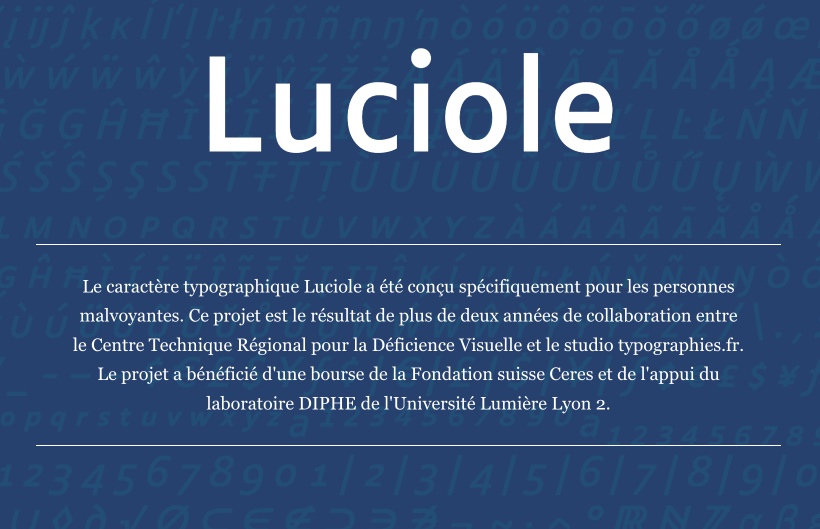
The major strengths of the Luciole police for the visually impaired: versatility and efficiency
Each style of the Luciole font contains more than 700 characters, making it possible towrite almost all European languages. The font also includes many Greek and mathematical symbols for scientific notation. Luciole’s aim is to make it easier for visually impaired students to read and efficient use by publishing professionals.
The Luciole font was created following a dozen specific design criteria to provide the best reading experience possible for visually impaired people. Particular care was taken in drawing numbers, mathematical signs and punctuation.

Luciole. Typography for the visually impaired
A typeface tested and approved by visually impaired readers
Following the Luciole project, three studies based on reading tests were conducted with visually impaired students or adults. These three studies all came to the same conclusion: a preference of visually impaired readers in favour of Luciole .
You can do a police test directly on the Luciole-Vision website without having to download it to your computer.
The Luciole Police is one of the best fonts for the visually impaired. Moreover, it is widely used by specialist reference publishers, but also by transcribers, teachers and developers.

Luciole is free under Creative Commons license
Luciole is available for download under a Creative Commons Attribution license, which covers the use (including commercial use) and distribution of the policy free of charge. Just download the fonts and move the files to the appropriate Fonts folder on your computer.
Luciole is an excellent and inclusive resource that has the advantage of improving the readability of texts for all audiences.
Questions You May Have About the Luciole Police
- What is the Luciole police?
Luciole is a typeface designed specifically for visually impaired people. It was developed by the Regional Technical Center for Visual Deficiency and the typographies.fr studio. - How was the Luciole police conceived?
The Luciole font was designed following a dozen specific design criteria to provide the best reading experience possible for visually impaired people. Particular care was taken in drawing numbers, mathematical signs and punctuation. - How can I get the Luciole policy?
The Luciole font is available for free download under a Creative Commons Attribution license. It may also be used for commercial purposes. - How to install Luciole font on Mac or PC?
To install the Luciole font (or any other font for that matter) on your computer, follow the steps below:- Download the Luciole font file.
- Double-click the downloaded file to open it.
- A preview of the font will be displayed. Click on the ‘Install font’ button in the lower right corner of the preview window.
On PC:
- Download the Luciole font file.
- Open Control Panel.
- Click on "Appearance and personalization".
- Click on "Polices".
- In the "Fonts" window, choose "File" from the menu, and then select "Install a new font".
- Navigate to the folder where you saved the Luciole font file, select it and click ‘OK’.

 English
Hello and thank you for highlighting this typo.
One question: has it been tested by dyslexic readers? Is it more adequate than the Arial font recommended in the FALC guide for example?
Thank you very much!