Last updated on 12 May 2026
‘Madam, I cannot read what is written on the board.’ This phrase, heard (or killed) in many classrooms, often hides a little-known reality: Typography can make the difference between a student who drops out and a student who progresses.
In classrooms, typography plays an important, but often invisible, role in the success - or failure - of learning.
While 10-15% French students present reading difficulties according to the DEPP Report 2024, the choice of a suitable font can become a powerful educational tool.
Specialised fonts for the school such as MDI École, Borel or OpenDyslexic can transform the learning experience of all students, from beginner readers to students with special needs. Let's take stock.
How do students' brains react to typefaces?
What happens in the brain of a child learning to read? Neuroscience reveals a fascinating process: Each letter triggers a cascade of unique neural activations, gradually transforming abstract forms into sounds and senses.
Research carried out by theANRT Nancy demonstrate that certain typographical features make it easier to read: higher letters, open shapes and well-differentiated glyphs. These findings are not only theoretical: they explain why some students systematically confuse ‘b’ and ‘d’, and how a well-designed font can prevent these mistakes.
Study highlights that students in difficulty devote 40% from cognitive effort to character identification, compared to 15% among expert readers. This alone justifies the systematic use of high-readability fonts in textbooks and teaching materials.

Learning to read and dyslexia: Why font makes all the difference
“Letters dance before my eyes.” This description, often given by dyslexic students, is not just a metaphor. The work of the Christina Poth typographer They reveal that the dyslexic brain processes visual information differently, sometimes creating the illusion that letters move or turn.
If no font can "cure" dyslexia, some typographical innovations can transforming the reading experience : thick letter bases that "anchor" the text, calculated spacings that reduce visual confusion, and distinctive shapes that limit inversions.
Top 6 best fonts for primary school
Police MDI School: a typo created by and for teachers

It is a typeface born directly from CP class observations. A thoughtful pedagogical approach, focused on the specific needs of French students in the reading and writing learning phase.
Each detail of this non-serif font meets a specific pedagogical need:
- Jambs lying on ‘p’ and ‘q’ which reduce by 40% the confusion between these mirror letters.
- A tiny 'l' with a small distinctive hook, avoiding confusion with the capital 'I' that traps 1 out of 3.
- A system of contrasts between round and angular letters, allowing the brain to create "families" of forms that are easier to memorize.
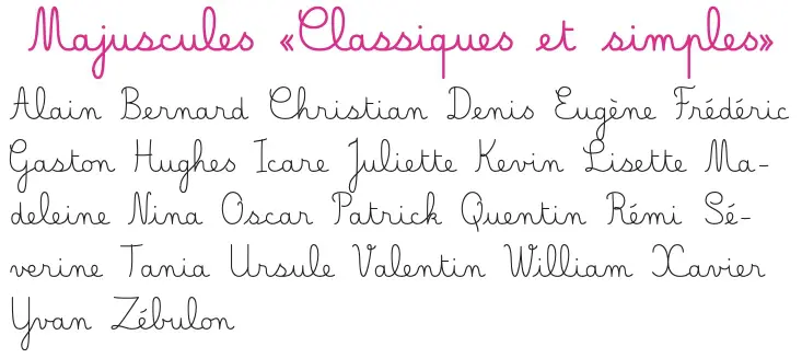
Borel police: a solution to learn cursive writing without difficulty

Based on research by ANRT Nancy, the Borel (Sans and Cursive) font family harmonises the joint learning of reading and writing. Its main characteristics:
- A fluid coherence between Roman and cursive styles.
- Rhythm hunting to better cut out syllables
- Open forms complying with national education standards
Police La Marelle: a free cursive (OFL licence) for learning to write

La Marelle is a cursive font free, shared on the Forge of Digital Commons, designed for teaching writing in elementary school. It is proposed under OFL Free Licence, This makes it easy to use and share in a school setting.
Its big strength: it offers several Combinable variants according to the needs of the class (cursive or printing capitals, version with lineage or without lineage, adjustable ascending/descending heights). Practical to adapt the supports to the level of the students (CP/CE1, remediation, students who need more marked visual cues, etc.).
Download the police La Marelle
“Typography must not be an invisible barrier to access to knowledge.” - Excerpt from the ANRT Nancy 2024 report
Typographic solutions for specific audiences
OpenDyslexic police: the free typo that helps dyslexic students

If you are looking for a Free policy for dyslexic students, OpenDyslexic is one of the references: it does not solve dyslexia, but can reduce some visual confusion and improve comfort on short texts
The story of OpenDyslexic begins with frustration: Abelardo Gonzalez, developer and father of a dyslexic child, faced with the prohibitive cost of specialised policies. His answer? Create a Free and Open Source Police for Dys This would upset the standards of typographic accessibility. Its innovation is based on three revolutionary principles:
- Heavier ‘feet’ anchoring each letter, such as weights that would prevent a leaf from flying away.
- Dynamic spacing that adapts to each combination of letters, creating ‘reading islands’ that are easier to decode.
- Deliberate asymmetry of mirror letters which makes it impossible to confuse ‘b’ with ‘d’ or ‘p’ with ‘q’.
The results? Spectacular. A survey conducted by the Dyslexia Association in 2023 on 1,200 dyslexic students shows not only a reduction of 30% reading errors, but also a significant improvement in self-confidence: 70% students report feeling "less stressed" when confronted with a text using OpenDyslexic.
Specialised police for primary education
Belle Allure: redesigned handwriting

Belle Allure is the creation of a school teacher, Jean Boyault. Does it reconcile the beauty of traditional handwriting with the requirements of modern readability? This School Police Proposes:
- A fluid but perfectly legible cursive, inspired by the natural movements of the hand.
- Optimized attacks and letter outputs to facilitate chaining.
- A trace of the letters that varies according to the position in the word and according to the previous letters.
Without Forgetica: A police that helps memorize

Developed by researchers from theRMIT University Melbourne , Without Forgetica represents a radical innovation. This is a font designed specifically to improve memorisation. Surprising. Its principle?
- Carefully thought out interruptions in the layout of the letters, generating a "wanted inconvenience".
- An 8° tilt to the left that forces the brain to a deeper treatment
- A subtle balance between clarity and complexity, designed to maximize memorization.
Note thata recent study by the New Zealand University of Warwick calls into question the effects of this font on memory.
Which font to choose for your class?
The Best font for educational materials is first and foremost the one that maximises readability: well-differentiated letters, comfortable spacing and consistency across all documents (sheets, evaluations, displays).
For media of kindergarten (labels, imagiers, instructions), an airy and highly legible font is often more effective than a ‘nice’ font: the objective is the rapid recognition of letters and words.
| 🎯 Objective | ✅ Recommended Police | 📊 Expected Result |
|---|---|---|
| Initial learning to read | MDI School | -40% errors of discrimination |
| Transition to cursive writing | Borel + Belle Allure | +25% of graphic quality |
| Support for dyslexic students | OpenDyslexic | -30% reading errors |
| Memorization of key content | Without Forgetica | +7% detention |
| Development of handwriting | Belle Allure | Improved speed and readability |
The future of school policies: Upcoming innovations
The art of typography is an ever-changing field. We are dreaming of future research by designers, typographers and laboratories in order to:
- Adaptive fonts modifying their grease according to the display medium
- Smart ligature systems evolving with the level of the student
- The integration of phonetic cues directly into the glyph design
Innovation does not prevent the search for standards if not global, at least European. We are talking about the adoption of a common reference framework of legibility criteria and the creation of a police bank certified by speech therapists.
Typography. A powerful educational tool
Typography is no longer just an aesthetic detail: it is a powerful educational tool that can transform the learning experience. Choosing a suitable policy can reduce by 40% reading errors in students in difficulty. It can also improve by 30% reading speed in some dyslexics, and significantly increase children's self-confidence.
MDI École, Borel and OpenDyslexic are just the first examples of a typographical evolution that is just beginning.
FAQ. Questions you may be asking yourself
Which font to choose for CP reading cards?
For reading media in CP, aims at a very legible font, with well differentiated letters (b/d, p/q) and open forms. Fonts designed for schools such as MDI School They can be a good choice, as they seek to limit the frequent confusions among beginner readers.
What font should be used to learn cursive writing at school?
For the learning of cursive, the ideal is a font that respects the forms expected at school and that remains regular, legible and progressive. Borel and Belle Allure are often used to work on cursive writing, and a font like La Marelle can be interesting thanks to its variants (with/without lineage, cursive or printing capitals).
Is there a free cursive policy adapted to the school?
Yes, yes. La Marelle is a cursive font free and distributed under OFL Free Licence, with variants useful in the school context. Other free options can also be found as needed, but the important thing is to check the license and the actual readability in class.
What free policy can help dyslexic students?
OpenDyslexic is one of the best known free fonts. It does not “cure” dyslexia, but some students report better reading comfort through shapes and contrasts that limit some confusion.
What font size should I choose for print media (exercises, evaluations)?
In practice, many teachers avoid sizes that are too small. A good basis is to test the equivalent 12–14 (or even more depending on the level and the audience), with a interlining sufficient. The most reliable: print a test sheet and check the reading comfort “in real condition”.
Is a ‘special memorisation’ font like Sans Forgetica really useful in the classroom?
Without Forgetica is interesting on paper because it was thought to force a deeper treatment, but the results are discussed according to the studies. It can possibly be used for targeted uses (revision cards, key concepts), but it does not replace a very readable font for current reading.
How to improve the readability of a document without changing the font?
Readability also depends on the layout: interlining, line length, spacing, contrasts, title hierarchy, ventilation, and print quality. Often, these settings bring an immediate gain, even with a “classic” font.

Thank you bcp. Very useful I did not know the borel police